 As we start the work week check out this infographic from the good folks at Good on the Overworked American. Is it time for vacation yet? Enjoy your week.

Showing posts with label informational graphics. Show all posts
Showing posts with label informational graphics. Show all posts
25 July 2011
The Overworked American
As we start the work week check out this infographic from the good folks at Good on the Overworked American. Is it time for vacation yet? Enjoy your week.


24 February 2011
Felton 2010 Annual Report


Nicholas Felton has posted his 2010 Annual Report. The 2010 Annual Report is an encapsulation of my father's life, as communicated by the calendars, slides and other artifacts in my possession.
Nicholas is the expert when it comes to showing data in a way that allows us to understand and also keeping track of everything in his life.
26 January 2011
Infographics Showcase


Are you a lover of Infographics? If so you need to check out The Infographic Showcase. The site is loaded with interesting graphics, information and comments of projects.
Great infographics will communicate complex amounts of information in a clean graphical presentation for the viewer to understand. Another great site that I have post about prior is the Good.is site for very current infographics.
So go at it, explain your weird world in clean graphics full of facts that amaze.
02 August 2010
Mapping the Interstate Graphically


This is a beautiful example of being inspired and reworking for another need. The London Underground map designed by H.C. Beck's was the inspiration for Cameron Booth to design this beautiful map of the US Interstate system. The map becomes a great way to communicate the complex system of roads that we call our Interstate. To view more or to order a copy, go to this link at Cameron Booth's website. Great design is inspired by observation.
26 May 2010
The Fallout SIgn - A History

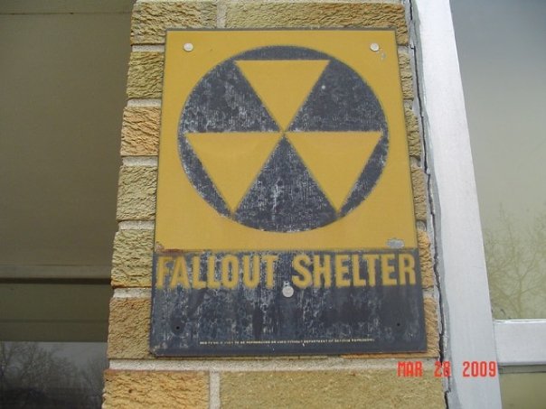
The Fallout Shelter Sign is a sign of the past that is slowly disappearing from our urban setting. The sign marks the locations that would shelter 50 persons or more incase of a nuclear attack. The attacker at the time was the USSR and the US was full of fear. The Cold War was started shortly after WWII as the nuclear capabilities on both side continued to grow. The Department of Defense came up with the Fallout Shelter program in 1961. This sign was posted on thousand of building from schools, to churches to public buildings. Supplies where placed in the basements of these building to help those who survived if the worst ever happened. Thankfully the worst did not happen at the time. The program was designed by Robert W. Blakeley, Blair, Inc and Bob Schoonover.
The National Fallout Shelter Sign will be a familiar sight in communities all over the United States next year. It will mark buildings and other facilities as areas where 50 or more persons can be sheltered from radioactive fallout resulting from a nuclear attack. The sign will be used only to mark Federally-approved buildings surveyed by architect-engineer firms under contract to the Department of Defense. The color combination, yellow and black, is considered as the most easily identified attention getter by psychologists in the graphic arts industry. The sign can be seen and recognized at distances up to 200 feet. The shelter symbol on the sign is a black circle set against a yellow rectangular background. Inside the circle, three yellow triangles are arranged in geometric pattern with the apex of the triangles pointing down. Below the fallout symbol, lettered in yellow against black, are the words FALLOUT SHELTER in plain block letters. Yellow directional arrows located directly underneath the lettering which will indicate the location of the shelter.
Read a very complete history of the sign and program at this link by Bill Geerhart. It is a fascinating history of an implimentation of this national program.
23 February 2010
Get Sporty - SportDesigner.com


With Olympic Fever running high, I came across this blog SportDesigner.com. This site is dedicated to the design that goes into sport pages around the world from graphics to photography. The site has focuses on the great design that comes about from great sport. Currently, the site is authored by Boudet (The Seattle Times) and Josh Crutchmer (The Chicago Tribune). Wonderful layout, informational graphics and photography cascade down the pages of the website. There is plenty to explore and discover about the world of graphical sport design. Play ball and see what happening now in the world of sports and graphics at SportDesigner.com.
04 February 2010
Felton 2009 Annual Report


The Felton 2009 Annual Report is available for your viewing "pleasure" online. Nicholas Felton is the master of taking facts and figures and converting them into visual organization that are beautiful, logical and engaging. Nicholas started his annual reports as a personnel project in 2005. Each year since, he has taken his life and converted it into these magnificent publications. This years report is based on the following statement from Nicholas' website:
Each day in 2009, I asked every person with whom I had a meaningful encounter to submit a record of this meeting through an online survey. These reports form the heart of the 2009 Annual Report. From parents to old friends, to people I met for the first time, to my dentist… any time I felt that someone had discerned enough of my personality and activities, they were given a card with a URL and unique number to record their experience.
I kept track only of who I gave survey invitations to, the number of the card and where it was given. The surveys answers were submitted via text forms, allowing the respondee to write whatever they desired, and leaving the task of making comparisons between the data up to me. I have used only this information to create the report, however accurate it may be. I have strived to sort and collate the data in a clinical and repeatable manner that could be reproduced by someone looking for the same stories I have selected.
If you want to see the power of informational graphics at their best, take a look at Nicholas Felton work. You will be amazed.
07 August 2009
How Do You Spend Your Day?

The New York TImes has a great interactive informational graphic on how we spend our life. The American Time Use Survey asked thousands of American residents to recall every minute of a day. The interactive graphic shows how people over age 15 spent their time in 2008. You can narrow the graphic by several factors like men, women, education and age. To view the graphic go to this link at the New York Times.
15 July 2009
Baseball Infographics


Take a love baseball, infographics, and add in some graphics and you get Flip Flop Fly Ball. Flip Flop Fly Ball is the creation of Craig Robison. Craig's graphics hit the ball out of the park. You have to look around and take it all in. Craig writes of his site:
As many of you will know, I'm a fan of baseball. And as I know, many of you aren't. So if you're not, this might not be for you, unless you like graphs, charts and pretty colours. For some reason, my brain can only really retain information if I write it down. Even better is to produce a chart. So, to help myself remember baseball facts and stats, I started making infographics. I've done a bunch of them, and there's an ever-growing list of new ones I want to do, so I decided to make a site totally dedicated to baseball infographics. There's other baseball-related stuff, too. It's called Flip Flop Fly Ball and can be found at http://www.flipflopflyball.com.
Go enjoy some stats and great inforgraphics on our national game of summer, baseball. The graphics are a grand slam of informational graphics at FlipFlopFlyin.
04 June 2009
Good Is Good Information Graphics


The good folks over at Good Magazine have posted good information graphics on flickr.com. You can look through tons of good informational design from their Transparencies Archive, all with good links back to the article at Good Magazine to view the large and good image. Have a good time looking at these wonderful examples of good design and good informational graphics. Check out the goods at Good Magazine, it is good stuff. Oh, and have a good day.
28 February 2009
The Crisis of Credit Visualized by Jonathan Jarvis
The Crisis of Credit Visualized from Jonathan Jarvis on Vimeo.Still confused on why the recession we are going through got to where it is? Watch this fabulous video by Jonathan Jarvis of The Crisis of Credit Visualized. Jonathan is studying in the Graduate Media Design Program at the Art Center College of Design in Pasadena. This video breaks down this complex problem into easy to understand visual terms that we can all understand. Now we need Jonathan to make us a video on how to get out of this mess. Great job Jonathan on this project!!
(via FontFeed)
Subscribe to:
Posts (Atom)