

Showing posts with label graphics. Show all posts
Showing posts with label graphics. Show all posts
06 February 2014
Apple Mac Font
09 May 2013
The History of Typography - A video short
Enjoy this video short on The History of Typography by Ben Barrett-Forrest.
"Knowing where we come from helps to direct us forward."
08 May 2013
Google Does Saul Bass
Today, Google honored the birthday of the legendary designer, Saul Bass with a Google Doodle Video. Thank you Google for honoring design.
23 April 2013
Movie Posters - More of the Same


Does this week's new movie poster look much like last week's? Well, yes of course. Take a look at this link that shows the common styles that seem to get used over and over complied by Christophe Courtois.
(via GeekTyrant)
14 March 2013
14 February 2013
George Lois
2012/11 George Lois from CreativeMornings on Vimeo.

If you can judge a man by the covers he has created, George Lois will stand out. George Lois put the iconic into Esquire magazine covers during the sixties and seventies. Best know for creating iconic images that brazed newsstands, Mr. Lois also took advertising into a direction anew. Know for creating work that is controversial and thought provoking, he designed for the times of our society.
The video above from a recent Creative Mornings talk shows George Lois presenting this work at the Met. This presentation is wonderful and allows him to comment and give insight to many of his more famous covers.
To see more of George Lois' work, visit his website. On the site are various projects including many of his Esquire covers explained, campaigns and logo work plus info and links about the 10 books he has put together over his long career.
(Many, many thanks to Tina Roth Eisenberg for developing Creative Mornings and posting the many videos from around the world of these wonderful speakers. You rock Tina.)


21 December 2012
Graphic Design - Now In Production At Hammer


Yesterday I got to visit the Hammer Museum at UCLA to see the Graphic Design - Now in Production exhibit. Wow, what a wonderful show. The show reviews and exhibits graphic works that are pure inspiration. The show ranges from typography to new media and everything in between. Curated by Andrew Biauvelt from the Walker Art Center and the wonderful Ellen Lupton from the Cooper-Hewitt, they hit a home run in pulling together the wide range of work that we create and presenting in a compelling and informative manner.
The show runs at the Hammer until January 6, 2013 so you still have time to take it all in. Make sure you get the catalog from the show which includes articles that are sure to get you thinking.
20 September 2012
Freelance Tip - Get Square

Every once in a while a game changer comes along to make life easier. In our age of technology you would think it would happen more often. The break through to make our business and lives more convenient is Square.
Square is a free app and card reader that allows you to accept credit card payments from clients. With one simple secure swipe you can charge the payment due and it will be deposited into your account. The small fee of 2.75% that Square charges for use is well worth the easy and speed. There is no charge if you don't use the service, only when you do, thus no month fees. Now everyone can accept plastic like the big boys. I have used it myself several times and found it to work flawlessly.
So forget the net 30, get your payments on the spot for your design work and if a friend happens to owe you $20, tell them you accept all major credit cards.
Be Square and sign up their site at squareup.com.
10 July 2012
Colorado Wildfire T-Shirts Help Victims


Over the last month, Colorado has been devastated by a series of wildfires destroying forest and homes alike. A group of graphic designers have gotten together to help by selling t-shirts were all proceeds go to assist wildfire relief agencies. Another great example of design helping out in a time of need. Show your support and help out by visiting Wild Fire Tees.
30 March 2011
Flags and More Flags


 In the need of a flag logo or button? If so you will have to check out this link to several sites that offer flag images and logos.
16 June 2010
Shakespeare In The Park - Paula Scher


For the last 16 years, Paula Scher has designed the posters for the famous Shakespeare in the Park. Paula has taken the art of posters for theater to new levels over the years with her unique designs. Above are examples from the 2010 poster created by Paula and her team at Pentagram. The performances this year includes The Winter’s Tale and The Merchant of Venice, starring Al Pacino as Shylock. The plays are performed in Central Park, NYC in the evenings. And did I mention, the shows are FREE, this must make your to see list if you are in town. To learn more about seeing a play, go to this link for the Public Theater.
Below are several examples from years past created by Paula. I would love to find a complete collection of these posters, so if you know of a link, let me know.


26 May 2010
The Fallout SIgn - A History

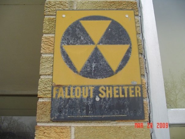
The Fallout Shelter Sign is a sign of the past that is slowly disappearing from our urban setting. The sign marks the locations that would shelter 50 persons or more incase of a nuclear attack. The attacker at the time was the USSR and the US was full of fear. The Cold War was started shortly after WWII as the nuclear capabilities on both side continued to grow. The Department of Defense came up with the Fallout Shelter program in 1961. This sign was posted on thousand of building from schools, to churches to public buildings. Supplies where placed in the basements of these building to help those who survived if the worst ever happened. Thankfully the worst did not happen at the time. The program was designed by Robert W. Blakeley, Blair, Inc and Bob Schoonover.
The National Fallout Shelter Sign will be a familiar sight in communities all over the United States next year. It will mark buildings and other facilities as areas where 50 or more persons can be sheltered from radioactive fallout resulting from a nuclear attack. The sign will be used only to mark Federally-approved buildings surveyed by architect-engineer firms under contract to the Department of Defense. The color combination, yellow and black, is considered as the most easily identified attention getter by psychologists in the graphic arts industry. The sign can be seen and recognized at distances up to 200 feet. The shelter symbol on the sign is a black circle set against a yellow rectangular background. Inside the circle, three yellow triangles are arranged in geometric pattern with the apex of the triangles pointing down. Below the fallout symbol, lettered in yellow against black, are the words FALLOUT SHELTER in plain block letters. Yellow directional arrows located directly underneath the lettering which will indicate the location of the shelter.
Read a very complete history of the sign and program at this link by Bill Geerhart. It is a fascinating history of an implimentation of this national program.
18 November 2009
John Van Hamersveld - Designer of Icons


John Van Hamersveld is a designer of icons, from the Endless Summer movie poster to a Beatles Album cover. John Van Hamersveld was born in Baltimore, Maryland in 1941 and took to art at an early age. He found his way to the West Coast and has been involved in the music and film industry as a designer since he created the bold and saturated sunset for the Endless Summer poster in 1966. John has may iconic designs that have become a part of our design world including his Jefferson Airplane Pinnacle Indian Poster 1968, the Beatles Magical Mystery Tour cover, the Rolling Stones cover for Exile to Main Street, Johnny Face (Crazy World Ain't It?), Jimi Hendrix, and posters for Cream at their Royal Albert Hall Reunion in 2005.
John is still working and designing today for the music and fashion industries creating works that reflect his 60's origins with a current modern day twist. His work is still very fresh and conveys a free spirt that seem to emanate across his career. The contemporary Mozart and Beethoven for the New West Symphony are wonderful and expressive. His current posters for Steve Winwood and Eric Clapton take us back to a day when concerts where about the music first.
John Van Hamersveld's work can be viewed at Post-Future and johnvanhamersveld.com.
I had the pleasure to meet John a few weeks ago at the Art Institute of California - Orange County where I teach. AICA-OC has a small show up on his work and John will be at the "official" gallery opening this evening, Nov. 18th from 4:30-7:30 if you are in the area and would like to meet him and have a poster signed.

04 November 2009
The Writing Is On The Walls - IdeaPaint


Spread out and let your creative ideas flow with this innovative product, IdeaPaint. IdeaPaint is the only paint out there designed to allow you to paint a surface and turn it into a dry erase board. Once you see IdeaPaint in action your mind will go crazy with all that you can do by turning all most any surface into a dry erase board. Your dry erase board can take on any shape that your wall or surface covers. The paint was formulated to work with all dry erase markers and allow you to erase no matter how long it sits. From a cost stand point, IdeaPaint is cheaper then a standard dry erase board, so easy to install (you just pick up a paint brush and roller) thus no drilling required.
The packaging design was done by the design firm, Jones. I love the design and believe it helps to emphasize the product's ease of use and the modern thinking that IdeaPaint will spark.
To learn more about IdeaPaint and to get a gallon, go to their website at this link. I am inspired and can think of several uses. I hope to get my hand on some soon and try IdeaPaint out myself.
14 August 2009
World Cup Bid Logo - The Game Is In US

Pentagram has designed a logo for the US bid to host the FIFA World Cup games in 2018 and 2022. The design was worked on by Michael Gericke and Luke Hayman. The design is to help sell the USA and bring the World Cup to the states. The bids will be up against 11 other countries with the decision being made in December 2010. I think the color choices help to bring the fun of soccer out and the US / United States is vivid. Let's hope that with Pentagram's help the games come back to the US. It will be an exciting time.
07 August 2009
How Do You Spend Your Day?

The New York TImes has a great interactive informational graphic on how we spend our life. The American Time Use Survey asked thousands of American residents to recall every minute of a day. The interactive graphic shows how people over age 15 spent their time in 2008. You can narrow the graphic by several factors like men, women, education and age. To view the graphic go to this link at the New York Times.
24 July 2009
Marking Melbourne


This new mark for the City of Melbourne is cool, hip, and makes a statement. The mayor of Melbourne, Lord Mayor Robert Doyle announces the new identity this week.
“The ‘M’ design will become an icon for Melbourne, synonymous with the modern, vibrant, cool city Melbourne is today and will continue to be in the future.
“The new identity will deliver more impact, be stronger, more flexible and reduce confusion as to who is delivering services. It will build greater long term identification and align with best practice around the world.”
“The new brand is strong and leading edge and will be instantly recognised as belonging to the City of Melbourne.”
Read additional information about the mark at the great logo site, Brand New, hosted by Bryony Gomez-Palacio and Armin Vit.
Be sure to also check out the new design book by Bryony and Armin, Graphic Design, Referenced. I have added it to my Amazon wishlist for my next order.
19 June 2009
Ellen and Julia Lupton on Design Your Life


Yesterday afternoon, I had the pleasure to meet and hear fellow Baltimoreans Ellen Lupton (on right) and her twin sister Julia Lupton (on left) as they presented their newest book, Design Your Life. They spoke on the campus of UCI to an intimate gathering for an hour, co-presenting their book. The talk was entertaining and insightful. They discussed chapters from Design Your Life on such subjects as toasters, bras, office organization, front porches, and flowers. After the talk, the Lupton sisters signed books and mixed with the crowd.
I found Ellen and Julia to be both delightful and authentic. It was nice to meet such happy people, two who enjoy not only their company but those around them. It was a great gathering and I thank the Lupton sisters for sharing with us. I started reading Design Your Life last night and have been savoring each section.


Subscribe to:
Posts (Atom)